Pull to refresh
33.95

Graphic design *

The process of visual communication and problem-solving through the use of typography, photography and illustration

Show first
Rating limit
Level of difficulty

Typography in UI/UX Design

Level of difficultyEasy
Reading time5 min
Views1.3K

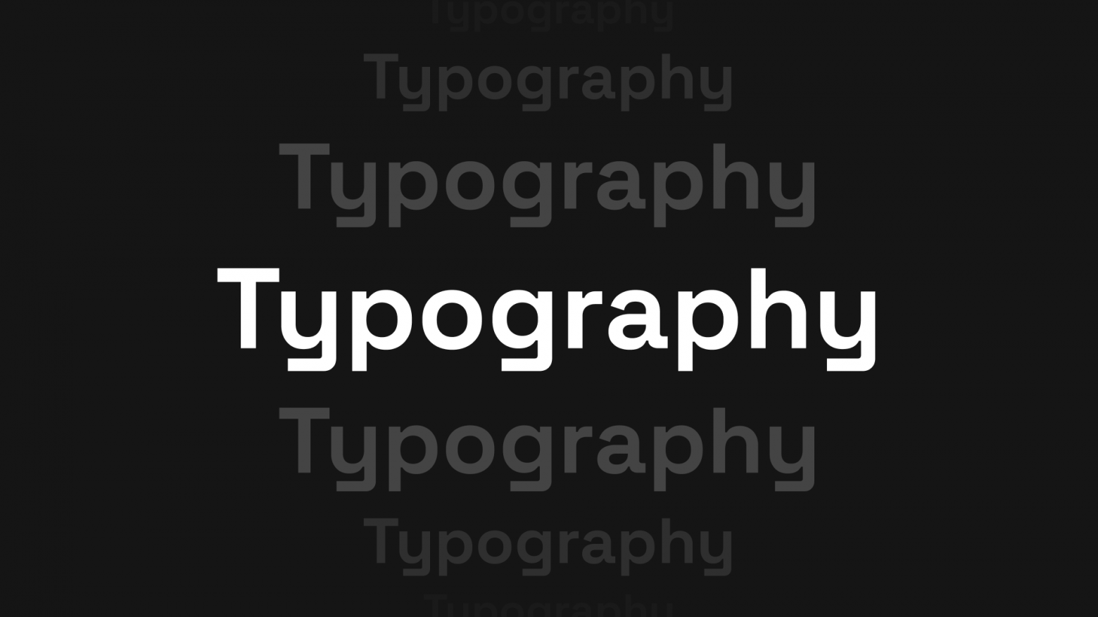
This article is about how to properly work with typography when developing websites and interfaces. In my work with Junior and Middle designers I often come across the fact that guys make very simple mistakes when working with text. And today I will try to show by examples how not to make these mistakes.

Main topics:
Font as a tool
Choosing a font
Contrast
Accentuation and typesetting
Line length
Vertical rhythm
Caps and Axes
My top Cyrillic fonts

Read more
Total votes 1: ↑1 and ↓0+1
Comments1

I trained a neural network on my drawings and give the model for free (and teach you to create your own)

Reading time2 min
Views3.2K

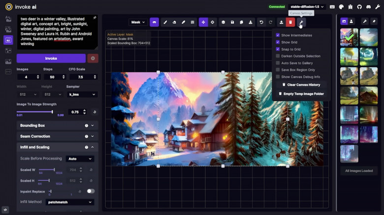
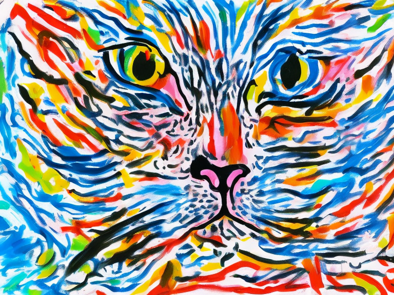
Great for seamless patterns, abstract drawings, and watercolor-styled images. How to use it and train a neural network on your own pictures?

Download the model here: https://huggingface.co/netsvetaev/netsvetaev-free

I wanna know!
Total votes 6: ↑6 and ↓0+6
Comments0

A tale of how PVS-Studio reimagined the bug

Reading time4 min
Views1K

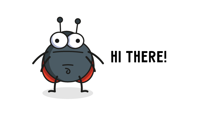
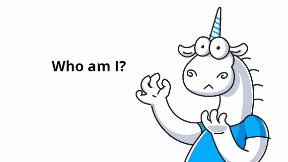
You all know our mascot — a unicorn — many people grew fond of him! However, PVS-Studio has a supporting character who is also the antagonist of our product — a bug! Well, a bug is not omnipresent, indestructible evil. It's more like an everyday or a work-related trouble. In this article, you'll learn how we created a new character, and why he looks like a ladybug. Oh, and if you wonder why the hell he has a belly button — keep reading!

Read more
Total votes 1: ↑1 and ↓0+1
Comments1

An Unexpected Article About Our Unicorn: Who Is the PVS-Studio Mascot?

Reading time5 min
Views1.9K

PVS-Studio has a mascot that became inseparable from the brand - a unicorn. Lately we've been getting many questions about our magic steed: why the unicorn, why has he changed so much, does he have hooves, how come he doesn't wear pants, and how do we draw him. The answers are finally here, in this very article.

Attention: there will be a lot of pictures. And I mean A LOT.

Read more
Total votes 11: ↑11 and ↓0+11
Comments0

The wave method of building color scheme

Reading time7 min
Views2.1K
image

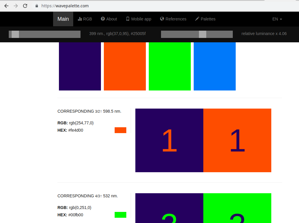
In life we often face the challenge of choosing the right colors. This happens when we need to choose clothes suitable for each other, shoes suitable for clothes, choose different wallpapers for the children's room, makeup, choose colors for our site and much more. The process of selecting several colors that combine with each other is called the construction of a color palette (gamut).

In colouristics there are several methods for constructing a color palette (color gamma) based on the arrangement of colors relative to each other in the color circle and, usually, having the same brightness. Harmonious perception of which is not sufficiently substantiated from the physical point of view.

The wave method of building color palette based on the relationship of color and acoustic waves, and also the concept of consonance (harmony) in music theory. Below is a more detailed description of the method.

This site allows you to choose the most harmonious combination of colors for your site, clothing, interior, etc.

The corresponding article was published on the site arxiv.orghttps://arxiv.org/abs/1709.04752. Results are available on our sitewavepalette.com.
Read more →
Total votes 4: ↑3 and ↓1+2
Comments2

Giving a presentation with perfect UI/UX design

Reading time4 min
Views5.5K

Introduction


Every single one of us gives presentations from time to time. What can be difficult about creating a couple of slides with great UI and nice content, right? Well… not really actually. In real life, things may get difficult.


You want to cover the whole topic and give as much information as fits on a slide. Then you go to Google to find some awesome pictures, and finally, cover it all with some fancy animation. And here is where things start falling apart: how do you balance all this stuff?


Take our helping hand, as we are here to show you how to create a presentation with both perfect user experience and user interface. Let's find out how to create perfect UI & UX design in a presentation.

Read more →
Total votes 20: ↑18 and ↓2+16
Comments2

The story of how we changed the PVS-Studio icon

Reading time5 min
Views1.2K


The 7.0 release marked a new milestone in the history of the PVS-Studio analyzer — the analysis is now available not only for the code, written in C, C++, C#, but also in Java. In addition to this global improvement, some existing mechanisms for the analysis are refined and improved, diagnostic rules are added. There was another significant change that you could hardly missed. We changed the icon.

Note. In the article, you will not find cunning tricks or tips on designing icons. The purpose of the article is a bit different this time — it is to tell a story, and, if possible, make it interesting.
Read more →
Total votes 35: ↑33 and ↓2+31
Comments0