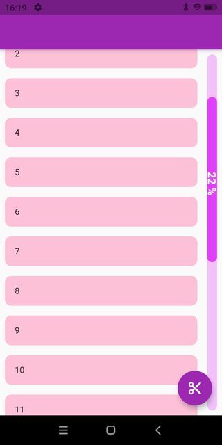
In my project, I was faced with the need to implement a scroll bar. The standard approaches didn't fully satisfy what designers wanted to see. Here is an example, it is slightly different in appearance from what I needed, but the essence is approximately the same: the scroll bar should be on the right side of the list and take into account the padding of the scroll bar, with the slider displaying the percentage of the scrolled part of the list.
There are several approaches to creating Flutter widgets: composition, CustomPainter, and RenderObject or any of its subclasses. In most cases, you can get by with composition and cover the rest with CustomPainter, but the most flexible and controllable method is using RenderObject.
Let's see an example of how you can implement a custom scroll bar using the RenderShiftedBox. A couple of words why exactly this one: first of all refer to Flutter documentation the widget wrapped in our custom scrollbar should be smaller than a parent (i.e. it will resize child widget) to allow scrollbar to be placed near and not over child widget, see what works for us:

It follows from the description that it is RenderShiftedBox that we need to use.
Implementation
Now let's start implementing a custom scroll bar, it's very simple:
class CustomScrollbar extends SingleChildRenderObjectWidget {
  final ScrollController controller;
  final Widget child;
  final double? strokeWidth;
  final EdgeInsets? padding;
  final Color? trackColor;
  final Color? thumbColor;

  const CustomScrollbar({
    Key? key,
    required this.controller,
    required this.child,
    this.strokeWidth,
    this.padding,
    this.trackColor,
    this.thumbColor,
  }) : super(key: key);

  @override
  RenderObject createRenderObject(BuildContext context) {
    return RenderCustomScrollbar(
      controller: controller,
      strokeWidth: strokeWidth ?? 16,
      padding:
          padding ?? const EdgeInsets.symmetric(
            vertical: 16,
            horizontal: 8,
          ),
      trackColor: trackColor ?? Colors.purpleAccent.withOpacity(0.3),
      thumbColor: thumbColor ?? Colors.purpleAccent,
    );
  }

  @override
  void updateRenderObject(
      BuildContext context, covariant RenderCustomScrollbar renderObject) {
    if (strokeWidth != null) {
      renderObject.strokeWidth = strokeWidth!;
    }
    if (padding != null) {
      renderObject.padding = padding!;
    }
    if (trackColor != null) {
      renderObject.trackColor = trackColor!;
    }
    if (thumbColor != null) {
      renderObject.thumbColor = thumbColor!;
    }
  }
}
Since our scrollbar has one child widget, that is why CustomScrollbar extends SingleChildRenderObjectWidget and override the updateRenderObject() and createRenderObject() methods to return a new instance of RenderCustomScrollbar.
Now let's move on to describing the RenderShiftedBox itself.
Initialize the constructor and define a listener that will trigger the method to update the slider position, don't forget to include markNeedsPaint() and markNeedsSemanticsUpdate() in that method so that the slider can be redrawn.
You can rewrite the methods for calculating the position, the height of the slider as you need, don't forget to take into account the paddings, in general, you can make the runner move even diagonally. In my case, the height of the runner depends on the height of the content, in your case, the height of the slider can be fixed or even change dynamically, here you are not limited to anything. I've looked at the calculation of the position of the slider in the standard RawScrollbar and adapted it a little bit.
Now let's go to the very important function performLayout():
@override
  void performLayout() {
    size = constraints.biggest;
    if (child == null) return;
    child!.layout(constraints.copyWith(maxWidth: _getChildMaxWidth()),
        parentUsesSize: !constraints.isTight);
    final BoxParentData childParentData = child!.parentData! as BoxParentData;
    childParentData.offset = Offset.zero;
  }

  double _getChildMaxWidth() {
    return constraints.maxWidth - padding.horizontal - strokeWidth;
  }
You need to override the performLayout() method and set a size for the RenderBox, otherwise, an exception will be thrown that the RenderBox hasn't set its dimensions. You can take the size from constraints and then override the size of the child widget and its position, from where it starts to be drawn. Here you can also change the size or position of the child widget if you want. In my case Offset.zero because I only needed to limit the width of the child widget.
After you've got all positions calculated according to paddings and any other optional parameters, you can start drawing, to do that we need to override the paint() method.
@override
  void paint(PaintingContext context, Offset offset) {
    if (child == null) return;
    context.paintChild(child!, offset);
    _resetThumbStartPointIfNeeded();
    _trackPaint(context, offset);
    _thumbPaint(context, offset);
    _textPaint(context, offset);
  }
The context.paintChild() will draw the child widget, it already knows its dimensions. Then we draw the track, the slider, and the text in turn. There's no need to go into detail about these methods in this article, you can read the code at this link. In general, in the paint method, you can draw whatever you need.