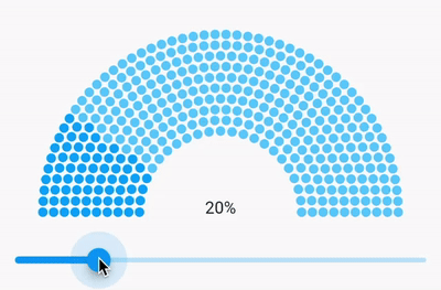
I bet you all had situations when a designer made a cool-looking UI and you just thought “cool, but how to implement this”. The same happened to me when a saw this progress bar in Figma.
Good thing is that in Flutter it’s pretty easy to create custom views and they will look awesome on every platform, but sometimes you just need to remember all these things that you have learned in geometric, and math classes. Yeah, we don’t always change the button’s color as someone thinks :)
A little bit of geometry
Let’s think what we have to make to implement the progress bar. Firstly, we have to find out a way to understand how many dots should be on the half-circle. Secondly, how to place these dots on it.
Calculating the number of dots
Let’s start simple, what if we have a straight line and we need to calculate how many points it can fit. The answer is that you take the length of the line, divide it by the diameter of the dot and add padding between them. And that’s done.
We do the same, but with a circle. If you know the radius of the circle, we can find its length. The formula is 2 * pi * r, but we need only half of it, so for us, the formula will be:
lineLength = pi * rFinally, we know the size (radius or diameter) of the dots and the spacing between them, so we can simply divide the line’s length by the size of the dots with spacing. The formula will be:
dotsNumber = floor(lineLength / (dotDiameter + dotsSpacing))We use floor because we can’t draw, say, half of the dot.
Placing dots on the circle
If we had a line, that would be easy to place the dots on it. We will start from 0 and add dotDiameter + dotsSpacing after the dots have been drawn.
Unfortunately, in our case, we can’t do it like that. To place dots on the circle we will use Polar Coordinates and will specify two coordinates:
how far away is the dot from the circle’s center (r),
dot’s angle (θ).
Having these coordinated we can easily convert them to Cartesian coordinates and draw afterward. The formulas are:
x = circleRadius * sin(dotAngle) + circleCenterX
y = circleRadius * cos(dotAngle) + circleCenterY
Implementation
We have everything to start implementing the progress bar. We will use a CustomPainter class to draw the view on the canvas.
The painters
Let’s add all arguments that we need and implement methods the CustomPainter requires, but the paint method.
class _DiagramPainter extends CustomPainter {
  _DiagramPainter({
    required this.dotRadius,
    required this.startBarRadius,
    required this.layers,
    required this.layersSpacing,
    required this.dotsSpacing,
    required this.progress,
    required Color dotColor,
    required Color progressDotColor,
  })  : _paint = Paint()
          ..color = dotColor
          ..style = PaintingStyle.fill,
        _progressPaint = Paint()
          ..color = progressDotColor
          ..style = PaintingStyle.fill,
        _dotDiameter = dotRadius * 2,
        _dotsSizeWithSpacing = dotRadius * 2 + dotsSpacing;

  final double dotRadius;
  final double startBarRadius;
  final int layers;
  final double layersSpacing;
  final double dotsSpacing;
  final double progress;

  final Paint _paint;
  final Paint _progressPaint;

  final double _dotDiameter;
  final double _dotsSizeWithSpacing;

  static const _startAngle = 270.0;
  static const _circle = 360.0;
  static const _halfCircle = 180.0;

  @override
  void paint(Canvas canvas, Size size) {
    // implement this later
  }

  @override
  bool shouldRepaint(covariant _DiagramPainter oldDelegate) =>
      dotRadius != oldDelegate.dotRadius ||
      startBarRadius != oldDelegate.startBarRadius ||
      layers != oldDelegate.layers ||
      layersSpacing != oldDelegate.layersSpacing ||
      dotsSpacing != oldDelegate.dotsSpacing ||
      progress != oldDelegate.progress;
}
There we have arguments to customize the progress bar, like the dot’s colors, spacing between dots and layers, and radius of the first (inner) circle. Also, we create the painters, so we won’t instantiate them every time in the painting method.
Don’t forget to implement shouldRepaint method, so the view gets repainted once one of the arguments is changed.
Draw first layer of circles
Let’s implement the paint method that draws a circle with dots.
@override
void paint(Canvas canvas, Size size) {
  final center = size.bottomCenter(Offset(0, -dotRadius));

  final lengthOfHalfCircle = pi * startBarRadius;

  final dotsNumber = (lengthOfHalfCircle / _dotsSizeWithSpacing).floor();

  final angleStep = _halfCircle / (dotsNumber - 1);
  var angle = _startAngle;

  final progressItems = (dotsNumber * progress).toInt();

  for (var dot = 0; dot < dotsNumber; dot++) {
    final radian = pi * 2 * angle / _circle;

    canvas.drawCircle(
      Offset(
        radius * sin(radian) + center.dx,
        radius * cos(radian) + center.dy,
      ),
      dotRadius,
      dot < progressItems ? _progressPaint : _paint,
    );

    angle -= angleStep;
  }
}
Here we get the center of the circle, calculating how many dots will be on the circle and the angle between them.
The important thing here is that we start drawing the dots from 270 angles (_startAngle) because we want the first dot to be in the bottom left corner and moving clockwise.
Also, have a look at how we calculate how many dots should have different (progress) colors.
Draw more layers
The last thing is to add more layers.
@override
void paint(Canvas canvas, Size size) {
  final center = size.bottomCenter(Offset(0, -dotRadius));

  var radius = startBarRadius;

  for (var layer = 0; layer < layers; layer++) {
    final lengthOfHalfCircle = pi * radius;

    final dotsNumber = (lengthOfHalfCircle / _dotsSizeWithSpacing).floor();

    final angleStep = _halfCircle / (dotsNumber - 1);
    var angle = _startAngle;

    final progressItems = (dotsNumber * progress).toInt();

    for (var dot = 0; dot < dotsNumber; dot++) {
      final radian = pi * 2 * angle / _circle;

      canvas.drawCircle(
        Offset(
          radius * sin(radian) + center.dx,
          radius * cos(radian) + center.dy,
        ),
        dotRadius,
        dot < progressItems ? _progressPaint : _paint,
      );

      angle -= angleStep;
    }

    radius += _dotDiameter + layersSpacing;
  }
}
A for-loop has been added and for every tick, we just increase the circle’s radius by adding the dot’s diameter and spacing between layers.
Wrap it
You can use your CustomPainter by wrapping it with the CustomPaint widget, but I think that is not user-friendly. So let’s wrap the painter with our widget.
class HalfCircleProgressBar extends StatelessWidget {
  const HalfCircleProgressBar({
    Key? key,
    required this.progress,
    required this.dotColor,
    required this.progressDotColor,
    this.dotRadius = _defaultDotRadius,
    this.startBarRadius = _defaultStartBarRadius,
    this.layers = _defaultLayers,
    this.layersSpacing = _defaultLayersSpacing,
    this.dotsSpacing = _defaultDotsSpacing,
  }) : super(key: key);

  final double progress;
  final double dotRadius;
  final double startBarRadius;
  final int layers;
  final double layersSpacing;
  final double dotsSpacing;
  final Color dotColor;
  final Color progressDotColor;

  static const _defaultDotRadius = 4.0;
  static const _defaultStartBarRadius = 68.0;
  static const _defaultLayers = 10;
  static const _defaultLayersSpacing = 1.0;
  static const _defaultDotsSpacing = 1.0;

  @override
  Widget build(BuildContext context) {
    final height = startBarRadius + (layersSpacing + dotRadius * 2) * layers;
    return ClipRect(
      child: CustomPaint(
        size: Size(height * 2, height),
        painter: _DiagramPainter(
          dotRadius: dotRadius,
          startBarRadius: startBarRadius,
          layers: layers,
          layersSpacing: layersSpacing,
          dotsSpacing: dotsSpacing,
          progress: progress,
          dotColor: dotColor,
          progressDotColor: progressDotColor,
        ),
      ),
    );
  }
}
Here is the widget that encapsulates some things about the painter and adds default values for the required arguments. The important thing here is that we add size for the CustomPaint so that Painter knows the size of the canvas and the widget can be correctly positioned, for example, in a Stack widget.
Also, ClipRect is added to cut everything that is out of the parent widget. That happens when a parent widget is smaller than the size needed to draw the progress bar.
Here is the link to the repository — https://github.com/ValeryPonomarenko/flutter-half-circle-progress-bar
